

The past couple days in the US, the Democrats have been debating about who should get to run against Trump. The transcripts seemed like a fun subject for dataviz.
All the code for these visualizations are posted here in various commits.
Firstly I thought it would be helpful to get a simple bar showing how much the candidates spoke.
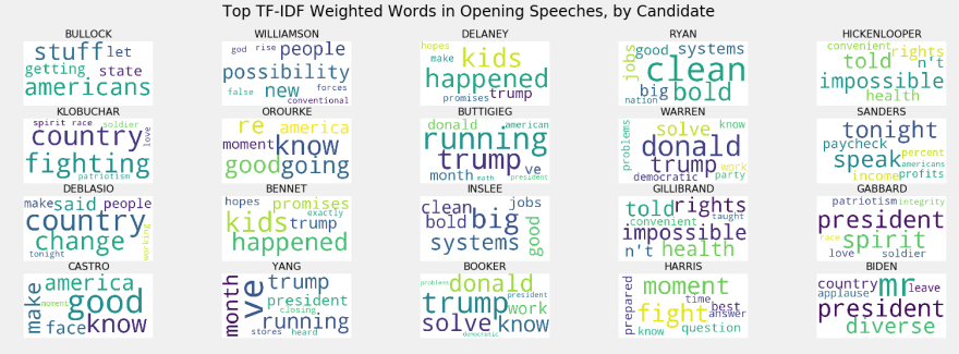
Note: as you'll see, I didn't take time to ensure a perfect cleanse of the data. There are some artifacts and errors, which will be obvious in the word clouds.

I was also surprised to find that if you create a TF-IDF based distance matrix...

... The speakers sort themselves out nicely. The lowest-polling person I've seen described as T1 is Mayor Pete, and the pattern holds whether or not you count him as T1.
Does this mean anything? I don't think so, at least not all on its own.
Finally here are some word clouds:

Overall I think this was a fun little exercise, but I don't suspect that it says too much about the race.
Let me know what you think! Especially if you notice a mistake.


The word clouds are really difficult to read due to the colors but regardless this is great!