My portfolio 📜
Eldar Dautović

Eldar Dautović @eldardautovic

About: Simple guy that loves solving problems with creative solutions!

Location:
Travnik, Bosnia & Herzegovina
Joined:
Apr 24, 2020

My portfolio 📜

Publish Date: Apr 26 '20
45 25

Hello 🤗

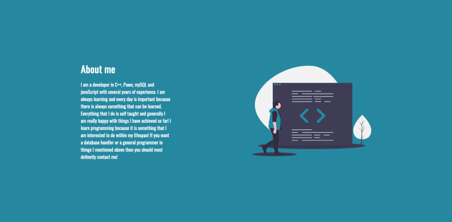
Hello everyone! This is my current portfolio I use and I made it a while back. It's fully made in HTML, CSS and a bit of javaScript for the form purposes.

What is the purpose of this post? 🤨

The purpose of this post is to get some feedback and to inspire some beginner front-end developers! I would appreciate if I would get some creative feedback on how it's currently looking! 🎉

Portfolio: https://salesmanunknown.github.io/

Comments 25 total

  • Colton Lathrop
    Colton LathropApr 26, 2020

    Some intial feedback:

    • Doesn't feel great on mobile
    • The most important content doesn't quite catch my eye, I struggle to find the important info.
    • Color scheme doesn't feel quite cohesive, almost like an attempt at something trendy; but not quite hitting the mark
    • My Work cards don't seem to fit the design.
    • Combining realism in the background with a modern flat elements, in my opinion, doesn't quite work well. One or the other.
    • I feel the content is too spread out, and can be compressed. The moment I land on the page I want to see your work, link to github and CV; I had to search here.
    • Larger fonts and better call-to-action for important content. The most important information should already be available.

    I'm not an expert, and this is just my initial opinion! I'd say this is a great start, and keep at it!

    Take what I say with a grain of salt. Looking forward to checking it out again in a week 😁

    • Eldar Dautović
      Eldar DautovićApr 26, 2020

      Thanks for the great feedback. I did this a while back and I will rework it when I'm available again!. Thanks once again!

    • Olalani Oluwaseun
      Olalani OluwaseunApr 26, 2020

      You really nail my points when I clicked on the link and @Eldar needs to take note of those points above.

  • Joel Lau
    Joel LauApr 27, 2020

    Hi @Eldar,

    Great job on your portfolio site, I think it looks amazing! Just to clarify, are you looking for feedback regarding the technical aspects, design, or something else (perhaps all of the above)?

    I too am a (relatively) junior developer and I am practicing my feedback skills. I would be more than happy to help!

    • Eldar Dautović
      Eldar DautovićApr 27, 2020

      I love getting feedback because it motivates me to do more! Any feedback is appreciated. I would love to hear your feedback!

      • Joel Lau
        Joel LauApr 29, 2020

        There are sooo many things I love about your website! It loads quickly, the code looks clean, and it feels modern and sleak. But let me try to talk more about what I think can be improved (from a design perspetive).

        General Tips

        • Use title case for all headers (this tool might help)
        • The font-family "Oswald" places characters very close too each other
          • makes content less readable
          • consider adding letter-spacing: 0.025em; to all your text elements
        • Even the best copywriters use Grammarly

        Hero Section / Masthead

        Home Page Section

        • Reconsider using the word "Salesman", it is a job title, and becomes a distraction from what you are branding yourself to be (Front End Web Developer)
        • The word "Me" and "My" is used too often in the top nav bar
          • Here's are some alternatives (About Me, Past Works / Projects, Resume, Contact)
        • It is not immediately clear what is in the image
          • This CAN give the mysterious vibe, but its still a bit confusing

        About Me Section

        About Me Section

        • "javaScript" -> "JavaScript"
        • paragraph is relatively long, consider...
          • consider cutting some information
          • breaking it up into smaller paragraphs
          • spread information over more sections
        • consider information hierarchy
          • About Me is the most important, and the other 2 are relatively equal (implied by your design)
          • to further emphasize the above, align the top of the image with the start of your paragraph

        My Work Section

        My Work Section

        • The section header ("My Work") feels a bit inconsistent with the other sections
        • your projects look very pretty, but are cropped at weird sections - consider using MS Paint, Photoshop, Figma or similar tool to get a proper crop to do them justice!
        • card component proportions are weird, consider using a layout grid to get proper spacing between elements

        Contact Me Section

        Contact Me Section

        • Feels a bit "squashed"
          • caused by shorted height than the other sections
          • add spacing between each form component

        Colors

        Color Wheel

        • its not completely necessary, but I recommend taking a quick look at color theory!
        • colors are often chosen by first selecting a primary color, and choosing complementary ones along some scheme (see options available in screenshot)
        • the colors you have chosen are very close to each other on the color wheel, and looks a bit heavy because of it
        • color calculator tool
        • Eldar Dautović
          Eldar DautovićApr 29, 2020

          Wow I liked this so much! Thanks for giving me such good feedback!

  • ismael
    ismaelApr 27, 2020

    Hi @eldardautovic ,
    I think you forgotten add funcionality in scrool down ().
    For everything else it looks pretty ;)

  • Eldar Dautović
    Eldar DautovićApr 27, 2020

    Thank you!

  • Marco Aurelio C. dos Santos
    Marco Aurelio C. dos SantosApr 27, 2020

    Awesome, man! Follow the feedbacks and keep going! 😃

  • Devansh Agarwal
    Devansh AgarwalApr 27, 2020

    Is it entirely based on HTML, CSS only?

    • Eldar Dautović
      Eldar DautovićApr 27, 2020

      HTML, CSS and a dash of javaScript for the form validation.

      • Devansh Agarwal
        Devansh AgarwalApr 27, 2020

        Oh! That's great! Like I visited the website and its good. Glad that only HTML & CSS (if we ignore the dash of JS) can be used to build a simple yet sleek website like yours.

  • Ben Sinclair
    Ben SinclairApr 27, 2020

    I'm not keen on the way that the main navigation is all for sections on the page except "My resume", which whisks you away to another site and presents something that really doesn't work well. You can't highlight any text, clicking on it anywhere switches to a two-page view even though you can't scroll to any other pages, it blurs at different resolutions, you can't print it, etc. Basically whatever service you're using to display that document isn't working well.

    I'd make the resume an actual page on your site, where people can copy text. It's short enough :)

    • Eldar Dautović
      Eldar DautovićApr 27, 2020

      You are right, thanks for standing that out for me!

  • Vlad Serhiychuk
    Vlad SerhiychukApr 27, 2020

    Use correct class names in code.
    Some problem with loading page.
    Big distance between navigation bar.
    But a good idea.

    • Eldar Dautović
      Eldar DautovićApr 27, 2020

      Thanks for the feedback! Will make sure to correct.

  • Roelof Jan Elsinga
    Roelof Jan ElsingaApr 27, 2020

    The website overall is quite nice! The padding on the about me and contact section is too much on a mobile device. It fits 1 or 2 words per line. You could make this 8 pixels on the x-axis instead.

    • Eldar Dautović
      Eldar DautovićApr 27, 2020

      Thanks a lot!
      I was researching the nav-bar building way in the time the website is made. Thanks for pointing out!

  • Shailesh Waghole
    Shailesh WagholeApr 27, 2020

    Nice Portfolio. Design and animation are very good.
    My Portfolio: shaileshw.pythonanywhere.com

Add comment