📗Looking for blog site design feedback - Home page (draft 1)
Hung Vu

Hung Vu @hunghvu

About: I write about various topics that I'm currently learning, be it front end, back end, cloud, DevOps, etc., you name it! For any questions you may have, you can reach out to me at: hello@hungvu.tech.

Location:
Washington, US
Joined:
Feb 2, 2022

📗Looking for blog site design feedback - Home page (draft 1)

Publish Date: Nov 2 '22
14 9

Hi all, I'm in the progress of building a new self-hosted blog site. I'm not really well-versed in web design, so I figured it will be better to gather feedback from the community. The first draft is shown below.

hungvu.tech - Home page - rough draft

For context:

  1. This is my first (serious) try using Figma.
  2. My goal is to have a minimalistic website, while not being so bland. I'm not fond of excessive effects or animation.
  3. This is my first draft.

Here is some information regarding the current design:

  1. Font is Roboto.
  2. Font sizes are 32, 24, 16, and 12 depending on the content.
  3. Border radius is 24.
  4. Spacing is based on a 4 pt. grid. The common gap distance is 16, and 32.

Here are some of my questions/concerns:

  1. I use Roboto because it is a de facto choice for the initial design, but it is a bit generic to me. What are other alternatives?
  2. Is the Hero section kind of bland (waste of space)?
  3. What would be a way to make a smooth transition between sections (e.g., from Hero to All Articles)? At the moment, I feel like they are visually disconnected.
  4. I feel like the article section is clustered, or is it?
  5. For the article filter, how should the choices be presented when there are multiple of them (for visual, and a11y)? For example, 10-choice is 10-row, or drop box, or something else (like Tags filter)
  6. I prefer a website with a neutral theme, so there is no light/dark mode. Or do I still consider a light/dark version of a neutral theme?

These are on top of my head at the moment, any other feedback is greatly appreciated!

Comments 9 total

  • Vincent A. Cicirello
    Vincent A. CicirelloNov 2, 2022

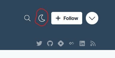
    I took a quick look. I like it. I'm confused by one of your questions though. You mention preferring a neutral theme, so I was surprised to see a theme toggle. Anyway, both your light and dark modes look nice. I think I prefer the dark mode, but that is just me. If you keep the 2 theme options, in addition to the toggle, you might consider initially selecting based on users dark vs light mode preferences. I think that can be done with a CSS media query.

    Overall, very nice.

    • Hung Vu
      Hung VuNov 2, 2022

      Thanks for the feedback. I have a few questions.

      1. There is no theme toggle, so what made you think there is one?
      2. There is only 1 neutral theme in the picture, so what made you think there are both light and dark mode?
      • Matt Ellen-Tsivintzeli
        Matt Ellen-TsivintzeliNov 2, 2022

        There is a light/dark toggle button next to the follow button at the top right of the page.
        screen grab showing the toggle button

        • Hung Vu
          Hung VuNov 2, 2022

          I see, that is my current website hosted on Hashnode, not the one I designed. I should repharse the post to make it clearer.

      • Vincent A. Cicirello
        Vincent A. CicirelloNov 2, 2022

        The toggle button toggles between what appears to be a light and a dark mode (the button that looks like the moon).

        • Hung Vu
          Hung VuNov 2, 2022

          Thanks for letting me know. That was not the website I intended to present. I did reorganize the post to resolve the confusion.

  • Vincent A. Cicirello
    Vincent A. CicirelloNov 4, 2022

    You mention preferring a neutral theme. What makes this neutral? I would think it is a light theme since it has dark text on a lighter background. It looks nice either way.

    • Hung Vu
      Hung VuNov 5, 2022

      That makes sense, probably I use the wrong term to describe the color. By saying "neutral", I mean a theme that can be used in both light and dark environment without creating too much distraction. For example, a pure white theme in a dark room makes me feel like I'm looking at the sun. However, the perceived brightness can be toned down using something more "neutral" like grey.

Add comment