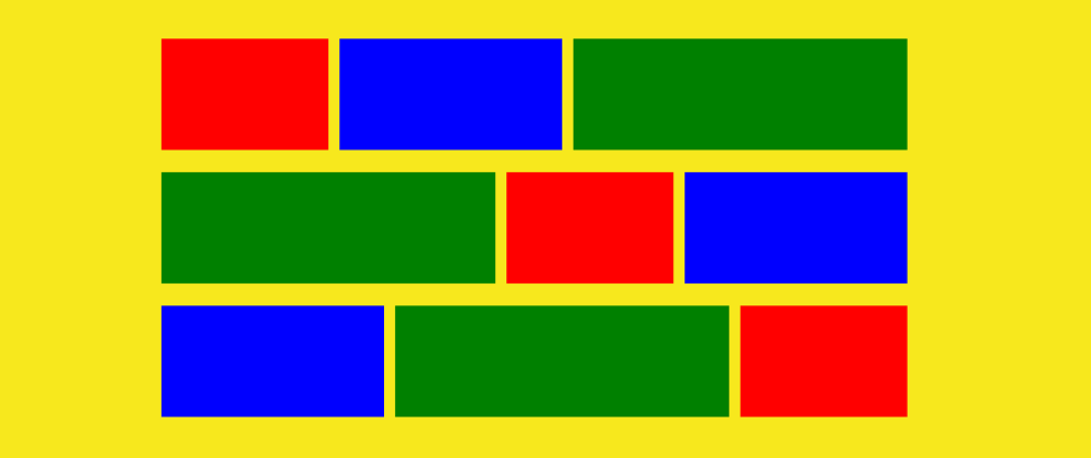
Since the advent of mobile devices and the massive adoption of these devices by users, developers have had to build websites that adapt well to different screen sizes. There are various methods to employ in responsive design, but layout was the most tricky—until Flexbox.
Before Flexbox: Using Floats and Positioning
Before Flexbox, developers relied on CSS floats, inline-block, and absolute positioning to create layouts. These methods worked but often required extra markup, clearfix hacks, and tricky positioning adjustments.
Example: A Simple Two-Column Layout Using Floats
<!DOCTYPE html>
<html lang="en">
<head>
    <meta charset="UTF-8">
    <meta name="viewport" content="width=device-width, initial-scale=1.0">
    <title>Float Layout</title>
    <style>
        .container {
            width: 100%;
            max-width: 800px;
            margin: 0 auto;
            overflow: hidden; /* clearfix to contain floated elements */
        }
        .left-column {
            width: 70%;
            float: left;
            background-color: lightblue;
            padding: 20px;
        }
        .right-column {
            width: 30%;
            float: left;
            background-color: lightcoral;
            padding: 20px;
        }
        /* Clearing floats */
        .clearfix::after {
            content: "";
            display: table;
            clear: both;
        }
    </style>
</head>
<body>

    <div class="container clearfix">
        <div class="left-column">Main Content</div>
        <div class="right-column">Sidebar</div>
    </div>

</body>
</html>
This method had problems:
- It required clearfix hacks to prevent layout breaking.
- Columns could collapse if their content exceeded the available space.
- Reordering elements required complex DOM changes.
Example: Centering an Element Using position: absolute
<!DOCTYPE html>
<html lang="en">
<head>
    <meta charset="UTF-8">
    <meta name="viewport" content="width=device-width, initial-scale=1.0">
    <title>Absolute Centering</title>
    <style>
        .container {
            position: relative;
            width: 100%;
            height: 100vh;
            background-color: lightgray;
        }
        .box {
            position: absolute;
            top: 50%;
            left: 50%;
            transform: translate(-50%, -50%);
            background-color: teal;
            padding: 20px;
            color: white;
        }
    </style>
</head>
<body>

    <div class="container">
        <div class="box">Centered Box</div>
    </div>

</body>
</html>
While this method works, it requires absolute positioning and transform hacks, making responsive adjustments harder.
How Flexbox Simplifies Layouts
With Flexbox, you can easily create complex layouts without floats or positioning hacks. It provides properties for alignment, distribution, and responsiveness.
Example: Two-Column Layout Using Flexbox
<!DOCTYPE html>
<html lang="en">
<head>
    <meta charset="UTF-8">
    <meta name="viewport" content="width=device-width, initial-scale=1.0">
    <title>Flexbox Layout</title>
    <style>
        .container {
            display: flex;
            max-width: 800px;
            margin: auto;
        }
        .left-column {
            flex: 2; /* Takes up more space */
            background-color: lightblue;
            padding: 20px;
        }
        .right-column {
            flex: 1; /* Takes up less space */
            background-color: lightcoral;
            padding: 20px;
        }
    </style>
</head>
<body>

    <div class="container">
        <div class="left-column">Main Content</div>
        <div class="right-column">Sidebar</div>
    </div>

</body>
</html>
Why is this better?
- No need for clearfix hacks
- Automatic element sizing (no need for fixed widths)
-
Easier responsiveness (use
flex-wrapto stack columns on smaller screens)
Example: Centering with Flexbox
<!DOCTYPE html>
<html lang="en">
<head>
    <meta charset="UTF-8">
    <meta name="viewport" content="width=device-width, initial-scale=1.0">
    <title>Flexbox Centering</title>
    <style>
        .container {
            display: flex;
            justify-content: center; /* Center horizontally */
            align-items: center; /* Center vertically */
            height: 100vh;
            background-color: lightgray;
        }
        .box {
            background-color: teal;
            padding: 20px;
            color: white;
        }
    </style>
</head>
<body>

    <div class="container">
        <div class="box">Centered Box</div>
    </div>

</body>
</html>
Why is this better?
- No need for absolute positioning
- No transform hacks
- Works dynamically without recalculating margins
Example: Responsive Flexbox Layout
<!DOCTYPE html>
<html lang="en">
<head>
    <meta charset="UTF-8">
    <meta name="viewport" content="width=device-width, initial-scale=1.0">
    <title>Responsive Flexbox</title>
    <style>
        .container {
            display: flex;
            flex-wrap: wrap;
            gap: 10px;
        }
        .box {
            flex: 1;
            min-width: 200px;
            background-color: salmon;
            padding: 20px;
            text-align: center;
        }
    </style>
</head>
<body>

    <div class="container">
        <div class="box">Box 1</div>
        <div class="box">Box 2</div>
        <div class="box">Box 3</div>
    </div>

</body>
</html>
Why is this better?
-
flex-wrapensures responsiveness (boxes stack when screen shrinks) -
gapprovides spacing without extra margins - No complex media queries needed
Conclusion
Before Flexbox, layouts relied on floats, positioning, and inline-block hacks, making responsiveness difficult. Flexbox eliminates these problems by providing a more intuitive and powerful way to align and distribute elements.
The next time you feel overwhelmed by Responsive design, just remember flexbox.
What are your thoughts on this.
I'm a full stack JS/TS developer available for hire. Feel free to reach out to me for your next project

