For years the <select> element has been notoriously difficult to style. Developers had to either accept the browser’s default look or resort to JavaScript-heavy solutions. But why has it been this way for so long?
Why Can’t <select> Be Styled?
The <select> component is a form control, meaning browsers handle much of its behaviour natively. This includes dropdown logic (have you noticed the options list can overflow the window?), keyboard navigation, and accessibility features. However, because these controls are deeply integrated into the OS, styling has been largely restricted.
Workarounds: From jQuery UI to shadcn/ui
Since native styling wasn’t an option, developers turned to libraries:
-
jQuery UI (early 2010s): Wrapped
<select>in adiv, replaced it with a<ul>. -
Custom Dropdowns (2015–2022): React/Vue solutions often replaced
<select>entirely. - shadcn/ui (modern approach): Uses Radix UI under the hood to create accessible dropdowns.
While these solutions worked, they came with trade-offs: extra JavaScript, potential accessibility issues, and performance overhead.
Enter base-select: A New Approach with a Caveat
With the introduction of the base-select property, browsers will allow full CSS styling of <select> without overriding most native functionality. This means:
- No need for JavaScript to handle dropdowns.
- Full control over appearance while keeping built-in accessibility.
- Potentially faster rendering and better performance.
Important Note: The base-select property is currently experimental and only available in Chrome 134+. Browser support is limited, so use this with caution in production environments.
Styling <select> with base-select
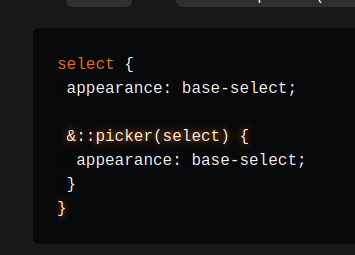
When styling the select element you must add appearance: base-select; to both the select and select::picker(select).
select {
 appearance: base-select;

 &::picker(select) {
  appearance: base-select;
 }
}
This tells the browser to allow the <select> element to be styled by CSS rather than using the system's default appearance.
Understanding ::picker(select): This pseudo-element represents the dropdown listbox (the "picker") of the <select> element. It allows you to style the listbox independently.
There are a few different pseudo-classes and pseudo-elements that are exposed to modify the select element. I've documented a few useful ones down below.
select {
 appearance: base-select;
 /* style the 'button' */

 &::picker(select) {
  appearance: base-select;
  /* style the 'listbox' */
 }

 &::picker-icon {
  /* style the 'button' icon */
 }

 &:not(:open) {
  /* style the 'button' when closed */

  &::picker(select) {
   /* style the 'listbox' when closed */
  }
 }

 &:open {
  /* style the 'button' when open */

  &::picker(select) {
   /* style the 'listbox' when open */
  }
 }

 & option {
  /* style the options */

  &::checkmark {
   /* style the checkmark on the checked option */
  }

  &:checked {
   /* style the checked option */
  }
 }
}
Demo: CSS-Only shadcn/ui Select
Let’s recreate shadcn/ui’s select component using only CSS. Here’s how we can do it:
- Styling the
<select>itself to match shadcn/ui’s look. - Customising the dropdown’s appearance.
- Ensuring accessibility is maintained.
Remember: This demo only works in Chrome 134+. If you can’t test it, I’ve included a GIF below so you can still see it in action.
Markup
The HTML structure remains simple. The <selectedcontent> element allows us to display and style the selected option separately, and we add a chevron icon to mimic shadcn/ui.
<select>
  <button>
    <selectedcontent></selectedcontent>
    <svg xmlns="http://www.w3.org/2000/svg" viewBox="0 0 24 24" fill="none" stroke="currentColor" stroke-width="2" stroke-linecap="round" stroke-linejoin="round" aria-hidden="true">
      <path d="m6 9 6 6 6-6"></path>
    </svg>
  </button>
  <optgroup>
    <label>Fruits</label>
    <option value="" hidden disabled selected>Select a Fruit</option>
    <option>Apple</option>
    <option>Banana</option>
    <option>Blueberry</option>
    <option>Grapes</option>
    <option>Pineapple</option>
  </optgroup>
</select>
Styling the Select Button
To start, we need to apply appearance: base-select and set some basic styles.
select {
 appearance: base-select;
 color: #71717a;
 background-color: transparent;
 width: 180px;
 box-sizing: border-box;
 padding: 0.5rem 0.75rem;
 border: 1px solid #e4e4e7;
 border-radius: calc(0.5rem - 2px);
 box-shadow: 0 1px 2px rgba(0, 0, 0, 0.05);
 cursor: pointer;
}
Positioning the content and icon:
select > button {
 display: flex;
 width: 100%;
 font-family: inherit;
 color: currentColor;
}

select > button > svg {
 margin: 0 0 0 auto;
 width: 1.2rem;
 height: 1.2rem;
}
Styling the Dropdown Listbox
The listbox must be styled separately, ensuring it appears smoothly when opened. We're using the relatively new starting-style to allow us to animate from display: none.
select::picker(select) {
 appearance: base-select;
 border: 1px solid #e4e4e7;
 padding: 0.25rem;
 margin-top: 0.25rem;
 border-radius: calc(0.5rem - 2px);
 box-shadow: 0 4px 6px -1px rgba(0, 0, 0, 0.1),
  0 2px 4px -2px rgba(0, 0, 0, 0.1);
 cursor: default;
 transition: opacity 225ms ease-in-out, transform 225ms ease-in-out;
 transform-origin: top;
 transform: translateY(0);
 opacity: 1;

 @starting-style {
  transform: translateY(-0.25rem) scale(0.95);
  opacity: 0;
 }
}
Enhancing Accessibility & Interactions
Improve focus visibility and ensure placeholder text stands out:
select:focus-visible {
 outline: 2px solid #a1a1aa;
 outline-offset: -1px;
}

select:has(option:not([hidden]):checked) {
 color: #18181b;
}
Custom Checkmark
We can replace the default checkmark with a custom SVG.
select option::after {
 content: "";
width: 1rem;
 height: 1.5rem;
 margin-left: auto;
 opacity: 0;
 background: center / contain no-repeat
  url("data:image/svg+xml,%3Csvg xmlns='http://www.w3.org/2000/svg' width='24' height='24' viewBox='0 0 24 24' fill='none' stroke='%2318181b' stroke-width='2' stroke-linecap='round' stroke-linejoin='round'%3E%3Cpath d='M20 6 9 17l-5-5'%3E%3C/path%3E%3C/svg%3E");
}

select option:checked::after {
 opacity: 1;
}
Conclusion
The <select> component is finally getting the flexibility it deserves. With base-select, we can create beautiful dropdowns without JavaScript. If you're interested in reading more check out the open ui explainer.
What do you think of base-select? Are you excited to ditch JavaScript-heavy dropdowns?
Thanks for reading! If you'd like to connect, here are my Twitter, BlueSky, and LinkedIn profiles. Come say hi 😊


I have some concerns about this - a lot of devices have their own native way of presenting choices (like the rolodex thing on iOS for example). In the same way as with the JS solutions, we don't want to be replacing the familiar, optimised native behaviour - at least not in all circumstances. And if we do it only in some cases, then the app becomes inconsistent.
I'm not sure what the solution is, though.