
With modern CSS we can create beautiful gauges with ease. It involves a bunch of techniques, so let's break it down and get started!
First, we create a 3x3 grid. We then add an element that covers the entire grid and is a full circle:
host::part(gauge) {
  background: background: conic-gradient(/* colors */);
  border-radius: 50%;
  grid-area: 1 / 1 / 4 / 4;
}
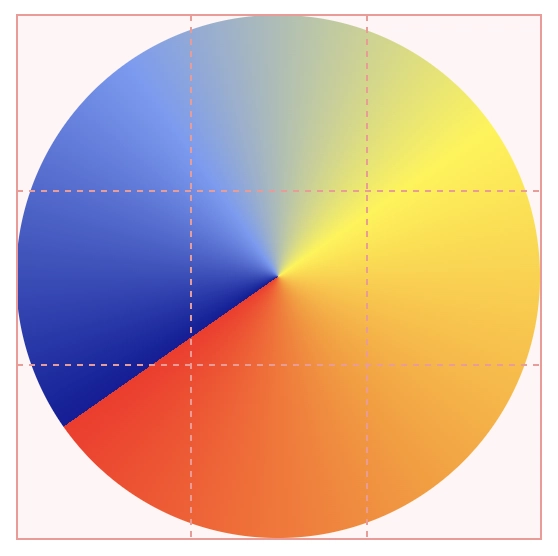
Next, we add a starting degree for the min position of the gauge, and how many degrees until the max position:
:host {
  --analog-gauge-start-angle: 235deg;
  --analog-gauge-range: 250deg;
}
Adding these to our gauge-part:
:host::part(gauge) {
  --analog-gauge-bg:
    #009, #69f, #ff0, #f90, #f00 var(--analog-gauge-range),
    #0000 0 var(--analog-gauge-range);

background:
  conic-gradient(from var(--analog-gauge-start-angle, 235deg),
  var(--analog-gauge-bg));
}
And we get:
What just happened? We changed the starting point of the gradient to where we want to place the min-label. We then added the length of the range using --analog-gauge-range), and after that point, we simply insert a transparent (#0000) color.
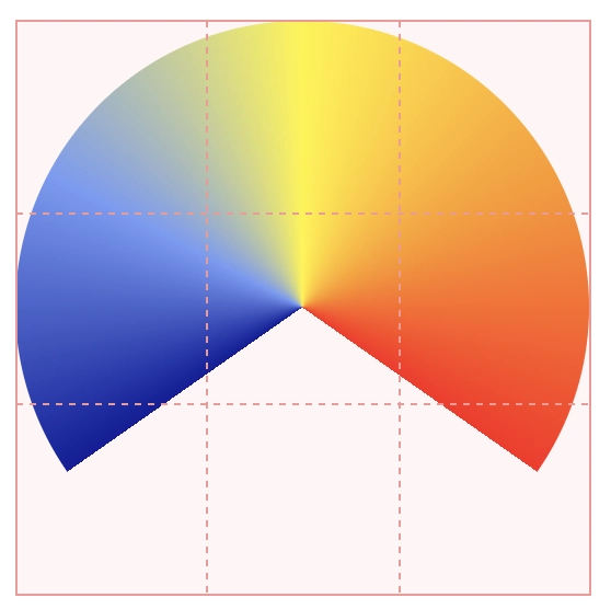
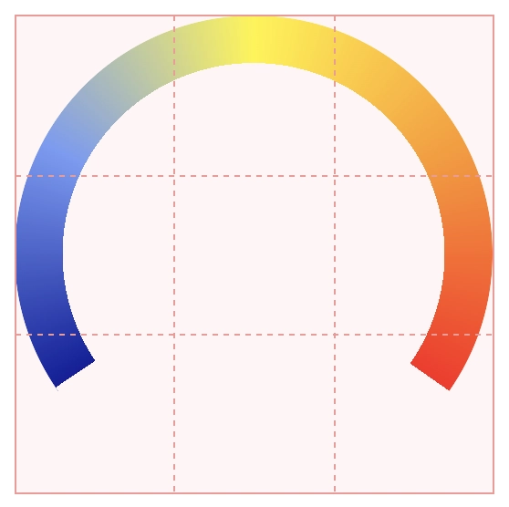
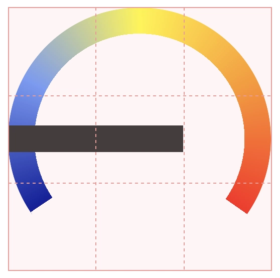
Next, let's add a circular mask to cut off the inner part of the circle — we control the width with a custom property, --analog-gauge-bdw:
:host {
  --analog-gauge-mask-circle:
    radial-gradient(circle at 50% 50%,
    #0000 calc(50cqi - var(--analog-gauge-bdw, 10cqi)),
    #000 0);
}
Let's add this to our gauge-part:
:host::part(gauge) {
  mask:
    var(--analog-gauge-mask-circle),
    var(--analog-gauge-mask-segment, none);
  mask-composite:
    var(--analog-gauge-mask-composite, subtract);
}
We'll get back to the segment-mask later! Now we have:
Needle in a haystack
Next up is the gauge needle. It's two grid cells wide:
:host::part(needle) {
  align-self: center;
  grid-area: 2 / 1 / 3 / 3;
  height: var(--analog-gauge-needle-h);
}
Let's add a circular mask to the point in the needle matching the absolute middle of our grid, and adjust the transform-origin of the needle to match that:
:host {
  -_m: calc(100cqi/6);
}
:host::part(needle) {
  mask:
    radial-gradient(circle at calc(100% - var(--_m)) 50%,
    #0000 0 2.5cqi, #FFF 2.5cqi);
  transform-origin: calc(100% - var(--_m)) 50%;
}
And we get:
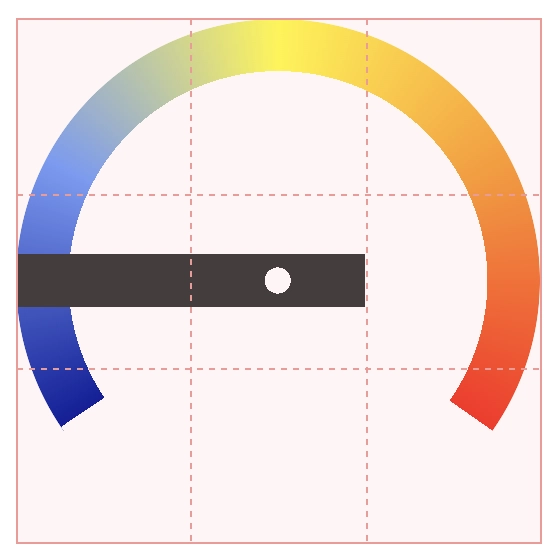
The --_m variable is 1/6th of the circle width (100cqi), and thus the middle of a grid cell.
Next, let's add a fancy clip-path to make it look like a gauge needle:
:host::part(needle) {
  clip-path: polygon(7.5% 50%,78% 0%,83% 35%,83% 65%,78% 100%);
}
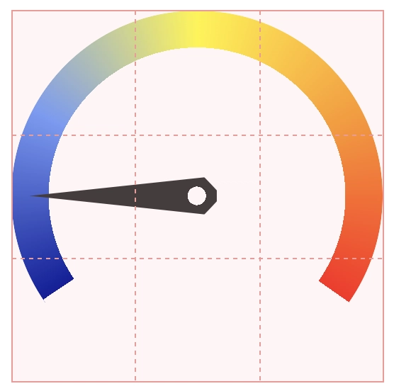
I made a clip-path editor if you want to make your own needle!
Labels
The labels are added in the last row of grid cells, and are again placed using grid-area:
:host::part(label-min) {
  grid-area: 3 / 1 / 4 / 2;
}
:host::part(label-max) {
  grid-area: 3 / 3 / 4 / 4;
}
Value Marks
For the value marks, we add an inner circle. This circle is the full width of the main circle minus the width of the gauge:
:host::part(value-marks) {
  aspect-ratio: 1;
  border-radius: 50%;
  grid-area: 1 / 1 / 4 / 4;
  place-self: center;
  width: calc(100cqi - (2 *
    var(--analog-gauge-bdw, 10cqi)));
}
The marks themselves are placed like on an analog clock.
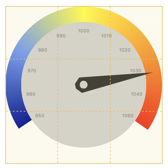
Here's what we've got now (I've added a grey background for clarity):
Segments
Remember the empty segment-mask we added earlier? Let's add that so we have an easy way to segmentize the gauge-gradient:
:host {
  --analog-gauge-segments: 10;
  --analog-gauge-mask-segment:
    repeating-conic-gradient(
      from var(--analog-gauge-start-angle, 235deg) at 50% 50%,
      #000 0 var(--analog-gauge-segments-w, 1deg),
      #0000 0 calc((var(--analog-gauge-range, 250deg) /
      var(--analog-gauge-segments, 5))));
}
Phew! That requires some explanation! Let's break it down:
- We create a mask at the same angle as the main gradient.
- The
--analog-gauge-segmentsvariable sets how many segments to divide the gauge into (default is 10). Setting it to 1 gives us a single segment - returning to our original solid gradient. - The repeating pattern creates thin black lines (
#000) with width of--analog-gauge-segments-w(default is 1deg). - Between these lines, we have transparent areas (
#0000). - The size of each segment is calculated by dividing the total range (
--analog-gauge-range) by the number of segments. - When combined with our previous mask using
mask-composite: subtract, these black lines create visible separations in our gauge.
And ... we're done! Let's remove the grid-preview and see the final gauge:
Variations
Let's create a bunch of variations by simply modifying the CSS custom properties.
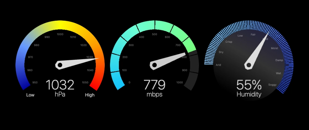
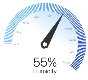
Humidity
.humidity {
  --analog-gauge-bg: #8cf, #6bf, #46e, #24c var(--analog-gauge-range),
    #0000 0 var(--analog-gauge-range);
  --analog-gauge-start-angle: 270deg;
  --analog-gauge-range: 220deg;
  --analog-gauge-segments: 100;
  --analog-gauge-values-bg: linear-gradient(
    210deg,
    light-dark(#abd7f9, #1e1b40),
    light-dark(#fff, #333),
    #0000 85%
  );
}
Here, we change the starting degree, add a gradient background to the value-marks and segmentize it heavily:
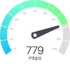
Download Speed
Here, we create a variation of the needle, and add a different color after the current value:
.download-speed {
  --analog-gauge-bg: #12c2fc, #6cffd4,
    #78ff80 var(--analog-gauge-value, 0%),
    light-dark(#ddd, #222) 0 var(--analog-gauge-range),
    #0000 0 var(--analog-gauge-range);
  --analog-gauge-needle-bg: light-dark(#445, #ccc);
  --analog-gauge-needle-cp: polygon(
    20% 35%,
    80% 0%,
    83% 35%,
    83% 65%,
    80% 100%,
    20% 65%
  );
  --analog-gauge-segments: 10;
}
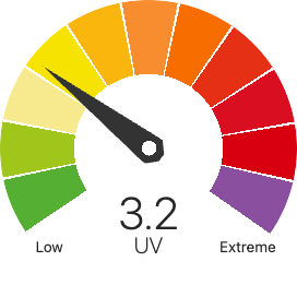
UV Index
Next, let's create a gradient with solid stops and a larger gauge-size:
.uv {
  --_dg: calc(var(--analog-gauge-range) / var(--analog-gauge-segments));
  --analog-gauge-bdw: 25cqi;
  --analog-gauge-bg:
    #55AF33 var(--_dg),
    #A0C61B 0 calc(2 * var(--_dg)),
    #F7E98E 0 calc(3 * var(--_dg)),
    #F6E301 0 calc(4 * var(--_dg)),
    #FAB60D 0 calc(5 * var(--_dg)),
    #F88D2F 0 calc(6 * var(--_dg)),
    #F76D00 0 calc(7 * var(--_dg)),
    #E53015 0 calc(8 * var(--_dg)),
    #D90E21 0 calc(9 * var(--_dg)),
    #D80010 0 calc(10 * var(--_dg)),
    #8A4F9E 0 var(--analog-gauge-range),
    #0000 0 var(--analog-gauge-range);
  --analog-gauge-segments: 11;
}
Web Component
I've wrapped all the logic in an easy-to-use web component:
npm i @browser.style/analog-gauge
Basic Usage
Import the component in your JavaScript:
import "@browser.style/analog-gauge";
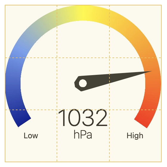
Add the component to your HTML:
<!-- Basic gauge with value and range -->
<analog-gauge value="50" min="0" max="100"></analog-gauge>
<!-- With label, min and max labels -->
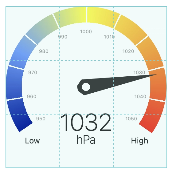
<analog-gauge
value="1032"
label="hPa"
min="950"
max="1050"
min-label="Low"
max-label="High"
values="11">
</analog-gauge>
Supported Attributes
The component accepts these attributes:
-
value: Current value (number) -
min: Minimum value (default: 0) -
max: Maximum value (default: 100) -
suffix: Text to append after value (e.g., "%", "°") -
label: Main label text -
min-label: Label for minimum value -
max-label: Label for maximum value -
values: Specify value markers in two formats:- A single number (e.g., "11") to generate evenly spaced markers
- A comma-separated list (e.g., "Low,Mid,High") for custom labels
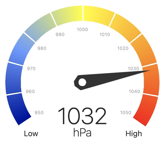
Demo
You can see a demo of the web component at browser.style/ui/analog-gauge or at CodePen:


This is top-notch css mastery. Lovely job, and even better lovely explanation.