Shipping Home Page Cleanups
Paweł Ludwiczak

Paweł Ludwiczak @pp

About: I'm a Product Designer, here at Forem (DEV)

Location:
Poland
Joined:
Oct 25, 2019

Shipping Home Page Cleanups

Publish Date: Feb 19 '20
59 31

TL;DR

Today we're shipping some small UI changes for the home page. Let us know if you can spot any bugs or issues since changes might have affected other views too.


A couple weeks ago the DEV team started looking into possible improvements for the DEV home page. We asked you for feedback and opinions and OMG my product designer soul was like 🤩🤩🤩🤩🤩🤩🤩

TL;DR of what happened

We had this idea to do a home page makeover. You gave us tons of input around what we should be focused on, tons of ideas for features and improvements, and tons of great feedback. Here's a bit more detailed recap:

For the Home Page itself, we decided to split our efforts into three separate "projects": 1) Low Hanging Fruits, 2) Feed Improvements, and 3) North Star Vision.

Shipping Low Hanging Fruit 🚢

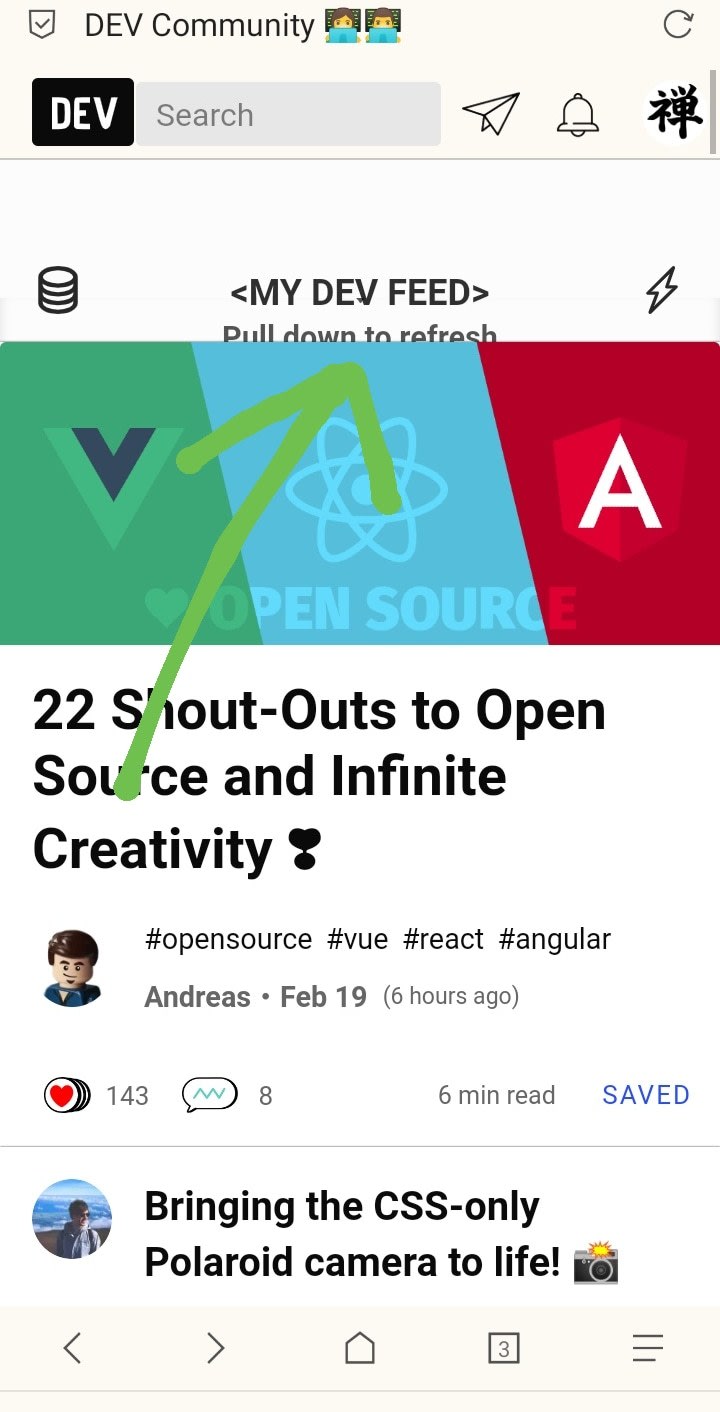
Today we're super pumped about shipping just a tiny bit of what we have planned. We made some small UI optimizations that are mostly visible on the home page but also on other views. Some of the improvements include:

  • De-emphasizing sidebars – there will be fewer "boxes" in the sidebars so that you can better focus on the feed itself. It helps us build some layout hierarchy.
  • Spacing – it should be less random now.
  • Typography – font sizes, line height, and colors should also be less random :D

...I guess we could call it "DE-RANDOMIZING DESIGN". That would be a catchy title for a medium DEV post, huh?

It's technically not much but visually, it may feel different. Give it a couple days to get used to it. And remember it's just a first step.

What you may notice 👀

This update is more minimalistic, and may even look less DEV-ish. Some of you pointed out that that DEV’s eclectic, glitchy & imperfect style is 100% on-brand, so why does it look like we’re scrapping all of that? Don’t worry, we see this. Although we love this “style”, a lot of it is caused by lack of rules and guidelines especially in design. We’re cleaning it up now so that we can re-incorporate more of the DEV brand of “organized disorder” over time. Plus, this will let us build great features and improvements efficiently in the future. Trust us when we’re saying that your initial impression will just be a temporary feeling.

What's next?

Of course, we still want your feedback. If you see any issues or bugs, please let us know either here or in GitHub.

We're also looking at some metrics to see if we didn't screw up anything. If we notice that "omg signups went down by 50000%" then we do git revert or whatever you do in that case (hey, I'm not a developer!). Also, I could be fired then 🤷‍♂️.

It's not over.

This is just a very first step towards where we want to be. The whole team is working pretty hard at defining that North Star vision, not only in terms of features, but also in UI.

Cheers!

(Cover photo by JESHOOTS.COM)

Comments 31 total

  • Josh Puetz
    Josh PuetzFeb 19, 2020

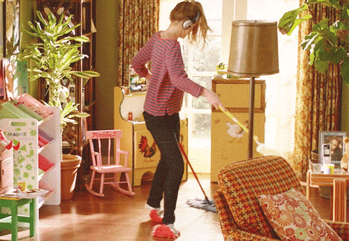
    Behind the scenes footage of @pp cleaning up the homepage! cleaning

    • Zen
      ZenFeb 19, 2020

      😂

  • Ben Halpern
    Ben HalpernFeb 19, 2020

    Really exciting to see this shipped!

    It's the first step in a lot of small changes which will get us closer to a "north star" in terms of usability and delight.

    We'll keep plenty of charm from the design as is, but remove the clutter and eye-strain.

    The work from @lisasy and @pp has been fabulous so far.

    Among additional core changes are modifications to the home feed which will help make it more relevant to everyone's technology tastes and interests on the site.

  • Andrew Brown 🇨🇦
    Andrew Brown 🇨🇦Feb 19, 2020

    Not sure if there was a change to the font but new design is really hard on my eyes.

    What it looks like is we went from having a busy page to having a busy unreadable page.

    • Andrew Brown 🇨🇦
      Andrew Brown 🇨🇦Feb 19, 2020

      You need to scrap that background. Without the boxes, it has really brought the contrast down and we need these grey fonts bumped up.

      Here's just me killing the BG

      • lose the background
      • bump up the contrast on whats left
      • fix the font.
      • Paweł Ludwiczak
        Paweł LudwiczakFeb 19, 2020

        This is really good feedback! Thanks a lot! Yea, we gonna ship some improvements in a day or two with other fixes as well. Improving contrast will be probably one of these fixes!

        Once again, I really appreciate the feedback! That’s exactly the kind of feedback I was hoping for!

      • Paweł Ludwiczak
        Paweł LudwiczakFeb 21, 2020

        One tiny change we've just delivered is adding subtle divider between each section in sidebar. That should help differentiate them, at least a little bit. Still no boxes, but the current plan is to bring them back at some point but in slightly different form. So why no boxes right now? We had to do some cleanups first 🤷‍♂️ so it's like intermediate step.

        tl;dr: we've just added subtle divider between sections in sidebar. it doesn't fix what you're talking about but it's step forward. we're planning bringing some different style for boxes though but we had to first kill them to clean up few things.

  • Vaibhav Khulbe
    Vaibhav KhulbeFeb 19, 2020

    The changes are quite good but some things are buggy I suppose. For example, the bar on the left has items squished together:

    Screenshot

    The two places where I marked should have more space.

    I'm excited to give more feedback and improve DEV more. 😋

    EDIT: Thank you for removing those boxes :)

    • Paweł Ludwiczak
      Paweł LudwiczakFeb 19, 2020

      I think you may need to clear your cache or something - because I can spot on your screenshot you still have a box behind that nav which shouldn’t be there.

      • Vaibhav Khulbe
        Vaibhav KhulbeFeb 19, 2020

        Did it. Looks so clean now!! Thank you for the improvements :)

  • Ryan Smith
    Ryan SmithFeb 19, 2020

    Looks good so far, nice work.

    Here are some initial observations of mine:

    • The featured card's tags have underscores between them on hover. It looks to only affect the first card.
    • Without the boxes, it can be hard to differentiate between sections on the right sidebar with the current headings and links there.
    • Hover styles are a bit too subtle, in my opinion.
    • Paweł Ludwiczak
      Paweł LudwiczakFeb 19, 2020

      Thanks! I’ll take a close look at these issue. Some are definitely bugs.

      Also, thanks for screenshots - thats always very useful.

    • Paweł Ludwiczak
      Paweł LudwiczakFeb 21, 2020

      We've added new hover styles, should be much more visible now :)

      As for boxes in sidebar (tl;dr: we added dividers between each section. this is all temporary though. we may bring boxes back at some point but in slightly different form)

      One tiny change we've just delivered is adding subtle divider between each section in sidebar. That should help differentiate them, at least a little bit. Still no boxes, but the current plan is to bring them back at some point but in slightly different form. So why no boxes right now? We had to do some cleanups first 🤷‍♂️ so it's like intermediate step.

      Also, have you thought about switching back to default theme in UX settings? It's not that different from you current theme but it does few things a little bit better :) Also, at some point we may consolidate these two themes anyway.

      • Ryan Smith
        Ryan SmithFeb 21, 2020

        Thanks, looks much better!

        I have thought about switching to the default theme, I just dislike the tan header since it seems to clash with the other colors. But I'm sure that is on your list of things to address. I agree they are fairly similar and should probably be merged to reduce maintenance on both.

  • Supun Kavinda
    Supun KavindaFeb 19, 2020

    Great work, but, honestly, I don't much like it for a few reasons.

    • The font on the homepage is completely new. And, posts have that funky font which I really like. So, two completely different types of fonts?
    • It's hard to read the sections without boxes.

    It feels like the homepage is another website, not DEV.

    Sorry, but that's my honest feeling. Anyone else feels that? 🤔

    • Paweł Ludwiczak
      Paweł LudwiczakFeb 19, 2020

      I hear you. As mentioned in the post - this work is definitely a step towards some bigger changes so I understand it may feel a bit awkward right now.

      In terms of font - the actual font face should be the same (if its not, its a bug and I’ll check it). What has changed though is sizing and weight. We’re on the way to build a typography system actually so it should eventually be pretty consistent across all views AND - what’s more important - should feel like you’re on DEV no matter what view you’re looking at.

      Also, you’re right - these changes are mainly for home page right now but other views are in the roadmap as well.

      • Supun Kavinda
        Supun KavindaFeb 19, 2020

        Great! I'm glad to hear that.

        Font: I tried clearing cache but still the posts and homepage have two different fonts.

        Here's what I see in the computed styles.

        Post:

        font-family: Palatino, 'Palatino Linotype', 'Palatino LT STD', 'Book Antiqua', Georgia, serif;
        

        Home:

        font-family: -apple-system, BlinkMacSystemFont, "Segoe UI", Roboto, Helvetica, Arial, sans-serif, "Apple Color Emoji", "Segoe UI Emoji", "Segoe UI Symbol"
        

        So to be clear, did you intend to change the font of the home?

        • Paweł Ludwiczak
          Paweł LudwiczakFeb 19, 2020

          Oh sorry, I misunderstood you. Actually that font was always different :) We haven’t changed ANY font face, just weights and sizes.

          Btw. You can adjust font of article in your UX settings page.

          • Supun Kavinda
            Supun KavindaFeb 19, 2020

            Previously the fonts in the post and the homepage were the same.

            Does changing the font from settings change the font of both of them? or just posts?

            • Paweł Ludwiczak
              Paweł LudwiczakFeb 19, 2020

              Just posts - it’s for reading experience. Some people prefer for example serif fonts. But having this choice doesn’t make much sense for other typical UI elements.

    • Paweł Ludwiczak
      Paweł LudwiczakFeb 21, 2020

      One tiny change we've just delivered is adding subtle divider between each section in sidebar. That should help differentiate them, at least a little bit. Still no boxes, but the current plan is to bring them back at some point but in slightly different form. So why no boxes right now? We had to do some cleanups first 🤷‍♂️ so it's like intermediate step.

  • Zen
    ZenFeb 19, 2020

    There's a bug:

    My gadget: Realme C2

    My browser: Via

    • Paweł Ludwiczak
      Paweł LudwiczakFeb 19, 2020

      #til we have pull down to refresh on mobile web 😯😦😧😮😲😵

  • Zen
    ZenFeb 19, 2020

    Bug again:

    Device: Samsung A20

    Browser: Via

  • Shannon Crabill
    Shannon CrabillFeb 20, 2020

    I noticed the changes when I logged in today. They look good. It's like a slightly more grown up, but still cool version of the DEV glitchy vibe you were talking about.

  • AxelleDRouge
    AxelleDRougeFeb 20, 2020

    Hello,
    I have noticed on the dark theme a problem with the hover color on the sideboxes, which is black on black :
    dev.to home page hover color

    • Paweł Ludwiczak
      Paweł LudwiczakFeb 20, 2020

      thanks, on my todo list! expect it to be fixed later today :)

      • AxelleDRouge
        AxelleDRougeFeb 20, 2020

        great thank you for your great job

  • chunkypigs72
    chunkypigs72Nov 26, 2024

    Welcome to our Shipping Hub, your go-to destination for streamlined delivery solutions! We’re committed to providing a hassle-free shipping experience tailored to your needs. Whether you’re tracking the design a package, exploring shipping options, or managing returns, our intuitive tools and resources make it simple and efficient. Enjoy fast delivery times, transparent pricing, and a dedicated support team ready to assist you every step of the way. Start shipping with confidence today!

Add comment