I finally completed my portfolio
Chantae P.

Chantae P. @taepal467

About: Hello, my name is Chantae. I use this platform to talk about my journey of getting into tech.

Location:
Los Angeles CA
Joined:
Dec 3, 2020

I finally completed my portfolio

Publish Date: May 20 '22
43 31

So I have created my portfolio. I had a hard time coming up with a design template for how I wanted my portfolio to look. I know I wanted something simple and not too complicated since I'm still a newb. So instead, I used the theme from Freecodecamp video. Even though I didn't use the exact design, do you think employers will see this a negative since I didn't come up with my own design and code? Let me know what you guys think!

P.S. The resume is still work in progress.

Update as of 5/24:
-Fixed the about me section to make it more readable on mobile devices.

Comments 31 total

  • Ben Halpern
    Ben HalpernMay 20, 2022

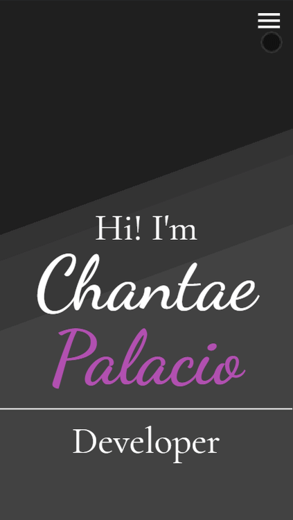
    Looks nice! Personality comes through in the design and seems very well executed!

  • codeyStein
    codeySteinMay 21, 2022

    Really unique, good job!

  • Viet Le
    Viet LeMay 21, 2022

    looks very unique!

  • АнонимMay 21, 2022

    [deleted]

    • Chantae P.
      Chantae P.May 21, 2022

      Okay thank you for telling me. I'll check it out and make changes

  • Andrew Baisden
    Andrew BaisdenMay 21, 2022

    It's pretty good and it works responsively too so well done. Definitely has a unique style and design to it which you don't often see.

    • Chantae P.
      Chantae P.May 21, 2022

      Right! That was exactly what I was going for. Simple and clean yet different. Thank you.

  • Janice Alecha
    Janice AlechaMay 21, 2022

    I am impressed and I'm inspired. I just survived my first week in SE class.

    • Chantae P.
      Chantae P.May 21, 2022

      Thank you and congratulations on completing your first week. Learning how to code is not easy. So no matter how hard it gets, just never give up! I know I wanted to quit plenty of times. But quitters never prosper!

      • Janice Alecha
        Janice AlechaMay 21, 2022

        Thank you for your words of encouragement. I need it right now.

        • Chantae P.
          Chantae P.May 22, 2022

          Trust me, I know how you feel. That's why I'm glad the DEV community exists. There's a lot of us who are struggling learning how to code. But as long as you keep pushing forward you'll make it.

  • Chantae P.
    Chantae P.May 21, 2022

    Thanks me too want too bad either

  • Chantae P.
    Chantae P.May 21, 2022

    Nice to know I'm not the only one.

  • Fernando Groders
    Fernando GrodersMay 22, 2022

    I would like to see a button to switch to dark mode, but besides that I liked it :D

    • Chantae P.
      Chantae P.May 22, 2022

      That's actually a good idea. That would be something cool to learn

  • Jatin Sharma
    Jatin Sharma May 22, 2022

    All looks good, everything is fantastic. Just One issue though-
    On mobile devices when you visit the section such as Home, About through Mobile Navigation. It should disappear after user clicks the link.

    ISSUE-

    Example

    • Chantae P.
      Chantae P.May 22, 2022

      Thanks for pointing that out.

  • Leo
    LeoMay 22, 2022

    It looks nice and clean, I also love the script font you chose.

    Just one problem about the nav items animation, moving the mouse to the edge of the nav item will lead to the unexpected animation loop.

    Hover Nav Item

    I think this can be fixed by moving the hover selector from the text to the container.

    • Chantae P.
      Chantae P.May 22, 2022

      I will make the changes. Thank you for pointing that out.

  • panfan
    panfanMay 22, 2022
  • Nuno Lemos
    Nuno LemosMay 22, 2022

    Looks great and works pretty nice.
    I only looked up on mobile and I would recommend a few things if you don’t mind. I think it would be a good idea if you try to use mix-blend-mode: difference on your hamburger icon so it can be visible on any section, dark or white. The other one is the about text, ot seems to small and with short line-height, probably it is intentional but I found it a bit hard to read.

    • Chantae P.
      Chantae P.May 23, 2022

      Yeah I just noticed that too. I'll work on the changes and thank you for pointing that out.

  • Keshav
    KeshavMay 24, 2022

    can u share your premium subscription of coderslang pls i dont have money to buy it or u can sponsper it for me just need for 6 month i willl pay u later after getting a job

  • Aaron Shenny
    Aaron ShennyMay 29, 2022

    great

  • Julia 👩🏻‍💻 GDE
    Julia 👩🏻‍💻 GDEJun 2, 2022

    I really like how/that you share your improvements on your portfolio. You as well as others will learn a lot from it.

Add comment