

I haven't been working explicitly with CSS as much as I would have liked to for the past couple weeks but either way on today's post I'm going to share with you some simple ways to spice up your website's links and/or buttons with CSS.
Also to keep myself involved with CSS more I'll make this the first of many posts to come specifically on CSS, which will be part of a series yet to be named, that I'll be adding short content to regularly.
Shine-By Effect
For lack of a better word I guess shine-by serves an understandable name for what occurs visually with this effect. An example of this effect is shown below.
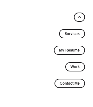
Let's break it down.
Two things happen as this effect is triggered on hover, one, the color of the button's text and it's background changes, and two, a band of light passes through from left to right simulating a "shine-by" effect.
Here goes the HTML.
Starting with the button.
<button class="button rounded outlined section-marker">
  <span class="item-sparkle-wrapper">
    <span class="item-sparkle"></span>
  </span>
  <span> Services </span>
</button>
Followed by the anchor
<a href="#" class="anchor rounded outlined section-marker">
  <span class="item-sparkle-wrapper">
    <span class="item-sparkle"></span>
  </span>
  <span> Services </span>
</a>
And finally the styles.
<style>
  *{
    font-family: Archivo,sans-serif;
  }
  .main{
    justify: center;
  }
  div{
    position: relative;
    margin-top: 40px;
  }
  .outlined{
    border: 2px solid #141316;
  }
  .rounded{
    border-radius: 50px;
  }
  .anchor, .button{
    position: relative;
    padding: calc(.5em - 2px) 1em;
    height: 2.5em;
    font-size: .75rem;
    color: #141316;
  }
  .anchor{
    text-decoration: none;
  }
  .button{
    overflow: hidden;
    cursor: pointer;
    background-color: transparent;
  }
  .button:hover, .anchor:hover{
    background-color: #141316;
    color: #ffffff;
  }
.item-sparkle-wrapper{
  position: absolute;
  top: 0;
  left: 0;
  right: 0;
  bottom: 0;
  background-color: transparent;
  border-radius: 50px;
  z-index: 1;
}
.section-marker:hover > .item-sparkle-wrapper > .item-sparkle, .item-sparkle-wrapper:hover > .item-sparkle{
  position: absolute;
  top: 0;
  bottom: 0;
  height: 100%;
  width: 5px;
  background-color: white;
  z-index: 2;
  transform: skewX(-15deg);
  animation: shine-by .3s 0s ease-in-out forwards;
}

@keyframes shine-by {
  0%{
    left: 0px;
  }
  100%{
    left: 110%;
  }
}
</style>
You can also use CSS's background-gradient to animate the ray of light passing by from left to right as shown in the following comment:

Maybe this method can also.
.div {
width:100px;
height:30px;
background: rgb(227,227,227);
background: linear-gradient(90deg, rgba(227,227,227,1) 0%, rgba(182,182,182,1) 7%, rgba(182,182,182,1) 13%, rgba(227,227,227,1) 25%);
background-size:900%;
background-position: 100% 0%;
animation: animation 1.8s;
animation-iteration-count: infinite;
animation-timing-function: ease-in-out;
}
@keyframes animation {
0% {
background-position: 100% 0%;
}
99.99% {
background-position: -30% 0%;
}
100% {
background-position: 100% 0%;
}
}
And that's all for the "shine-by" effect.
Use it in your projects or better yet get creative and make it more visually stunning to bring your links and anchors to life.
But don't overdo it, simplicity is key.
Let the anchors shine.


Your Article was great.
Follow my YouTube Channel for amazing Web Development Tutorials.
youtube.com/channel/UCDT8sIFy3pW8L...