Articles by Tag #chart
Browse our collection of articles on various topics related to IT technologies. Dive in and explore something new!


How to create diagram of your project's folder structure in 3 simple steps | convert your folder structure to diagram
Converting your project's folder structure to a diagram can be useful in case of presentation,...


Implement Chart Export in Different Formats in Flutter
In today’s data-driven applications, displaying information through charts and exporting them in...


Simplify Your Finances with the Flutter Expense Tracker
TL;DR: Learn how to simplify financial management with the Flutter Expense Tracker Sample! Track...


billboard.js 3.14 release: viewBox resizing!
New v3.14 release came out today! This release comes with 5 new features, 8 bug fixes and bunch of...


Display Chart in Express.js App using CanvasJS
Express.js is a powerful tool for creating server-side applications, and CanvasJS makes it easy to...

Easily Build an SIP Calculator Using the Syncfusion .NET MAUI Toolkit Charts
TL;DR: This guide walks you through building a cross-platform investment calculator using the...
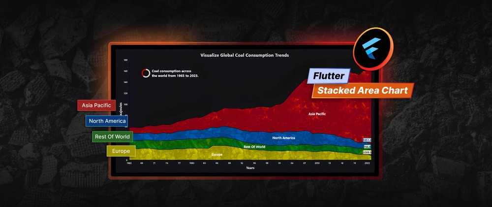
Visualizing Global Coal Consumption Trends with Our Flutter Stacked Area Chart
TL;DR: Let’s visualize global coal consumption trends using the Flutter Stacked Area Chart. We’ll...


Stock Price Simulation: Visualize Real-Time Market Data Using React Candle Chart
TL;DR: Let’s see how to simulate and visualize real-time stock prices using the Syncfusion React...


Chart of the Week: Creating a WPF Doughnut Chart to Visualize the New European Parliament’s Composition in 2024
TL;DR: Let’s demonstrate how to visualize the 2024 European Parliament composition with the...

How to add a scrollbar to Syncfusion Flutter Charts
TL;DR: Learn to add scrollbars to Syncfusion Flutter Charts using the Range Slider and Range Selector...

Creating a Comparison (Year over Year) Chart for Daily Data Across Two Years Using CanvasJS
In today's data-driven world, businesses and analysts often need to compare daily performance metrics...

Transform JSON into Stunning Charts: Auto-Generate Visuals with Syncfusion® .NET MAUI Toolkit
TL;DR: Discover how to create dynamic charts using Syncfusion® .NET MAUI Toolkit effortlessly....

Forecast Stock Market Trends with AI-Powered Blazor Candle Charts
TL;DR: Build an AI-powered stock forecasting tool using Blazor Candle Charts to predict market trends...

Pie Chart Best Practices: How to Visualize Data Effectively
TL;DR: Let’s see how to use a Pie Chart for effective data visualization. This blog covers best...


Chart of the Week: Creating a .NET MAUI Radar Chart to Visualize Wind Directions
TL;DR: Explore how to create a .NET MAUI Radar Chart to visualize wind directions in major cities!...

Visualize the G7 Government Debt Projections with Flutter Range Column Chart
TL;DR: Let’s visualize the G7 countries’ debt projections from 2024 to 2029 using the Syncfusion...


Flutter Bar Chart Example: Comprehensive Guide
Introduction Data visualization is a crucial aspect of modern app development. It helps transform...


How to Use Dual-Axis Charts for Effective Data Visualization?
TL;DR: Dual-axis charts help compare two datasets with different value ranges on the same chart,...

Build an AI-Powered Air Quality Dashboard: Real-Time Analytics & Predictive Insights with WPF Spline Chart
TL;DR: Learn to build an AI-powered air quality monitoring dashboard with the WPF Spline Chart. It...

Water Consumption Forecasting with AI-Powered Smart Flutter Spline Chart
TL;DR: Leverage Syncfusion Flutter Spline Chart with AI to forecast New York City’s water consumption...

View 100+ Years of Economic Superpowers’ Exports with .NET MAUI Stacked Area Chart
TL;DR: Let’s see how to use the .NET MAUI Stacked Area Chart to visualize 100+ years of exports by...

Visualize Global Temperature Anomalies with a Dynamic WPF HeatMap Chart
TL;DR: This blog provides a step-by-step tutorial on creating a WPF HeatMap Chart using Syncfusion...

Visualize the Top 10 Countries Driving Renewable Energy Investments with Stunning React 3D Charts
TL;DR: Learn to visualize the top 10 countries in renewable energy investment using Syncfusion’s...

Create a Flutter Column Chart to Visualize the World’s Largest Wind Power Producers
TL;DR: Let’s visualize the top 7 wind power producers using the Syncfusion Flutter Column Chart....

Visualize Workforce Data with Interactive React Drill-Down Charts
TL;DR: Build interactive workforce analytics dashboards using React Drill-Down Charts. Transform...

Chart of the Week: Visualizing Top 25 Largest Countries Using .NET MAUI Column Chart
TL;DR: Visualize the top 25 largest countries of the world using the Syncfusion .NET MAUI Column...

Stock Market Trends Analysis Using .NET MAUI Toolkit Candle Chart
TL;DR: Let’s see how to analyze stock trends using the .NET MAUI Toolkit Candle Chart. We’ll fetch...

Top 5 Angular Chart Libraries to Enhance Your Web Apps
TL;DR: The top five Angular chart libraries are Syncfusion® Charts, Highcharts, FusionCharts,...

React Synchronized Charts: The Perfect Tool to Compare Multiple Datasets
TL;DR: Synchronized charts link multiple charts for coordinated data analysis. Syncfusion React...


Visualize U.S. Gulf Coast Kerosene-Type Jet Fuel Prices with .NET MAUI Fast Line Chart
TL;DR: Discover how to create an interactive data visualization with Syncfusion’s .NET MAUI Fast Line...