Articles by Tag #chartoftheweek
Browse our collection of articles on various topics related to IT technologies. Dive in and explore something new!


12 Chart Design Tips Every Developer Needs To Know
TL;DR: Poor chart design can distort insights and confuse users. This guide shares 12 actionable tips...


Build a WPF Health Tracker Dashboard: Visualize Water Intake & Sleep Patterns with Interactive Charts
TL;DR: Want to turn your WPF app into a wellness dashboard? This post walks you through building a...

Visualizing Energy Consumption Trends with WPF Surface Charts
TL;DR: Build an interactive energy analytics dashboard in WPF using Surface Charts. Learn how to...

Build a Real-Time KPI Dashboard in .NET MAUI Using Charts and MVVM
TL;DR: Create a real-time KPI dashboard in .NET MAUI with charts and MVVM architecture. This guide...

Visualize Global AI Investment Trends Using .NET MAUI Doughnut & Column Charts
TL;DR: Turn raw AI investment data into actionable insights by building drilldown charts in .NET MAUI...

Build Interactive Doughnut Charts in .NET MAUI for Mobile Dashboards
TL;DR: Dive into the world of data visualization with Doughnut Charts in the .NET MAUI Toolkit. This...


Build a Compact Restaurant Dashboard in .NET MAUI with Spark Charts and Radial Gauge
TL;DR: Learn how to build a compact restaurant management dashboard using Syncfusion .NET MAUI...

Build a Student Analytics Dashboard in WPF with Interactive Charts
TL;DR: Build MVVM-based WPF dashboard architecture covering data models, ViewModel projections, and...

Visualize Your Music: Real-Time WPF Charts That Sync with Sound
TL;DR: Learn how to build real-time WPF charts for audio visualization using MVVM architecture. This...


Easily Build an SIP Calculator Using the Syncfusion .NET MAUI Toolkit Charts
TL;DR: This guide walks you through building a cross-platform investment calculator using the...
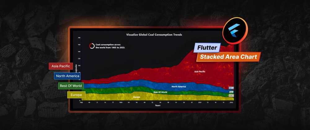
Visualizing Global Coal Consumption Trends with Our Flutter Stacked Area Chart
TL;DR: Let’s visualize global coal consumption trends using the Flutter Stacked Area Chart. We’ll...

Track and Visualize your Product Sales Data with the .NET MAUI Bullet Chart
TL;DR: Let’s see how to create a Bullet Chart using the .NET MAUI Linear Gauge. This chart is ideal...

Sleep Pattern Analysis using .NET MAUI Toolkit Range Column Chart
TL;DR: Learn to analyze sleep patterns using the .NET MAUI Range Column Chart. This guide walks you...

Create 3D Column Charts in .NET MAUI to Display America’s Top 10 Sports
TL;DR: Let’s see how to build an interactive 3D Column Chart using the .NET MAUI Toolkit to visualize...

How to Develop a Health Monitoring Interface with WinUI Charts
TL;DR: Learn how to build a real-time patient health monitoring dashboard using Syncfusion® WinUI...

Create an Interactive Heat Map Using Flutter Charts
TL;DR: Learn to create an interactive heat map using the Flutter Charts. You’ll learn to add...

How to Build Variance Indicators Using .NET MAUI Toolkit Charts for Natural Gas Price Volatility
TL;DR: Want to visualize natural gas price volatility with more than just basic charts? Syncfusion’s...

S&P 500 Returns After Rate Cuts: Visualized Using a Flutter Heatmap
TL;DR: Explore how to visualize S&P 500 returns after interest rate cuts using a Risk Heat Map...

Unlock Insights on Export Trends with a .NET MAUI Toolkit Stacked Area Chart
TL;DR: Learn to visualize Saudi Arabia’s export trends across continents using the .NET MAUI Toolkit...

Heikin-Ashi vs. Candlestick Charts: Which Is Better for Market Trend Analysis in WPF?
TL;DR: Let’s see how to create a Heikin-Ashi Chart using WPF Charts control and compare it with the...

How to Build a Real-Time ECG Monitoring Dashboard in WPF Using a FastLine Chart
TL;DR: Building a Real-Time ECG Monitoring Dashboard with WPF Charts addresses the unique challenges...
Stock Market Trends Analysis Using .NET MAUI Toolkit Candle Chart
TL;DR: Let’s see how to analyze stock trends using the .NET MAUI Toolkit Candle Chart. We’ll fetch...

Discover India’s Top Hotel Brands with Stunning .NET MAUI Lollipop Charts
TL;DR: Visualizing hotel inventory share can be challenging due to the complexity of the data. This...

Visualize Global Temperature Anomalies with a Dynamic WPF HeatMap Chart
TL;DR: This blog provides a step-by-step tutorial on creating a WPF HeatMap Chart using Syncfusion...

From Chat to Charts: Build an AI-Powered .NET MAUI Chatbot That Converts Text into Charts
TL;DR: Building an AI-powered .NET MAUI Chatbot that transforms natural language requests into...

Visualizing Geo-Spatial Data in .NET MAUI with Interactive Charts and Maps
TL;DR: Learn how to build a Geo-Analytics Dashboard in .NET MAUI with maps, charts, and MVVM....

Build AI-Powered Smart Sales Dashboards with .NET MAUI Charts
TL;DR: Learn to build a cross-platform AI-powered Sales Dashboard using Syncfusion® MAUI controls....

Create Professional Layered Column Charts for Accommodation Trends Using .NET MAUI
TL;DR: Comparing multiple hotel performance metrics across Europe in 2024, such as energy costs and...

See Who Rules Cricket: ICC Trophy Wins in a Powerful .NET MAUI Treemap Chart
TL;DR: Visualizing ICC trophy wins by cricket teams can be challenging due to the hierarchical nature...

How to Build a .NET MAUI Beeswarm Chart for Stock Price Volatility Visualization
TL;DR: Learn how to create a custom .NET MAUI Beeswarm Chart using Syncfusion® to visualize stock...